Increased heart attacks in the winter may be due to lack of sunshine
Seasonal Variation in Cardiac Death Rates is Uniform across Different Climates
American Heart Association conference presentation,Nov 07, 2012,
Bryan G Schwartz, Robert A Kloner, Good Samaritan Hosp, Los Angeles, CA
BACKGROUND
Total and cardiac death rates are increased in winter versus summer.
The factors influencing this seasonal variation are not well studied.
METHODS
We obtained daily death certificate data from health departments in a variety of climates (Texas [TX], Arizona [AZ], Georgia [GA], Los Angeles [LA], Washington [WA], Pennsylvania [PA], Massachusetts [MA]) from 1/1/05 through 12/31/08 and compared them. Average seasonal values for each day of the year were obtained by calculating a 19-day centered moving average (to smooth the curve) and taking the average values of the 4 years’ curves.
RESULTS
Average seasonal values varied by location but all locations revealed a “U” shaped curve with peaks in winter and troughs in summer (Figure 1).
Using raw daily death rates, the peak 8 day period was significantly greater than the trough 8 day period (p<0.0001 for each location).
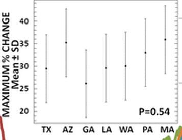
Total death rates parallel circulatory death rates . The data were normalized to (divided by) the average annual death rate for that location (Figure 2) revealing very similar patterns in the difference between peak versus trough despite very different climates . The maximum % change (using the peak 8 day period and the trough 8 day period) was calculated using raw daily death rates. Maximum % change was similar, 26-36% across a wide spectrum of climates (p = NS between locations) (Figure 2).
CONCLUSIONS
While different locations report different average total and circulatory death rates, when normalized by average annual death rate the “U” curves are superimposed suggesting an acclimatization phenomenon. There is a 26-36% greater death rate in winter than summer despite different locations and climates.
– – – – – – – – – – – – – – – – – –
Figure 1: Circulatory Death Rate
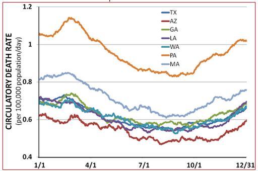
Figure 2: Normalized Circulatory Death Rate
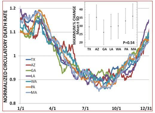
Figure 2a: Note that Arizona and Mass. have similar ranges
See also VitaminDWiki
Not just elderly: for 180,000 adults, death rate 2X higher if low vitamin D – May 2012
Half as many heart deaths for those with high levels of vitamin D – meta-analysis Sept 2012
Vitamin D intervention reduced death due the heart failure by 32 percent – Feb 2012
Echocardiograms confirm problems with low vitamin D – May 2012
30 ng perhaps best for cardiovascular - graphs from many countries - 2011.pdf file
Lack of vitamin D is a predictor of heart failure – Sept 2010
96 percent of heart failure patients had less than 30 ng of vitamin D – March 2011
Cardiovascular disease may be reduced by vitamin D – June 2011
Coronary Artery Disease predicted by low levels of vitamin D – April 2012
Heart Failure early death 2X more likely if less than 20 nanograms of vitamin D – June 2012
Low levels of vitamin D associated with all cause mortality – Oct 2012
See also web
Audio recording of this presentation MIGHT be available in the future
AHA: Winter Heart Attack Not Sparked by Cold MedPage Today comment on this presentation
- Discussion after the presentation considered:
- Colder weather might increase vessel constriction
- Shorter days might decrease vitamin D
- Less physical activity during winter
- ABC News comment on this presentations
- When we normalized the data for location, we found very similar patterns for circulatory death rates in between peak versus trough despite very different climates,